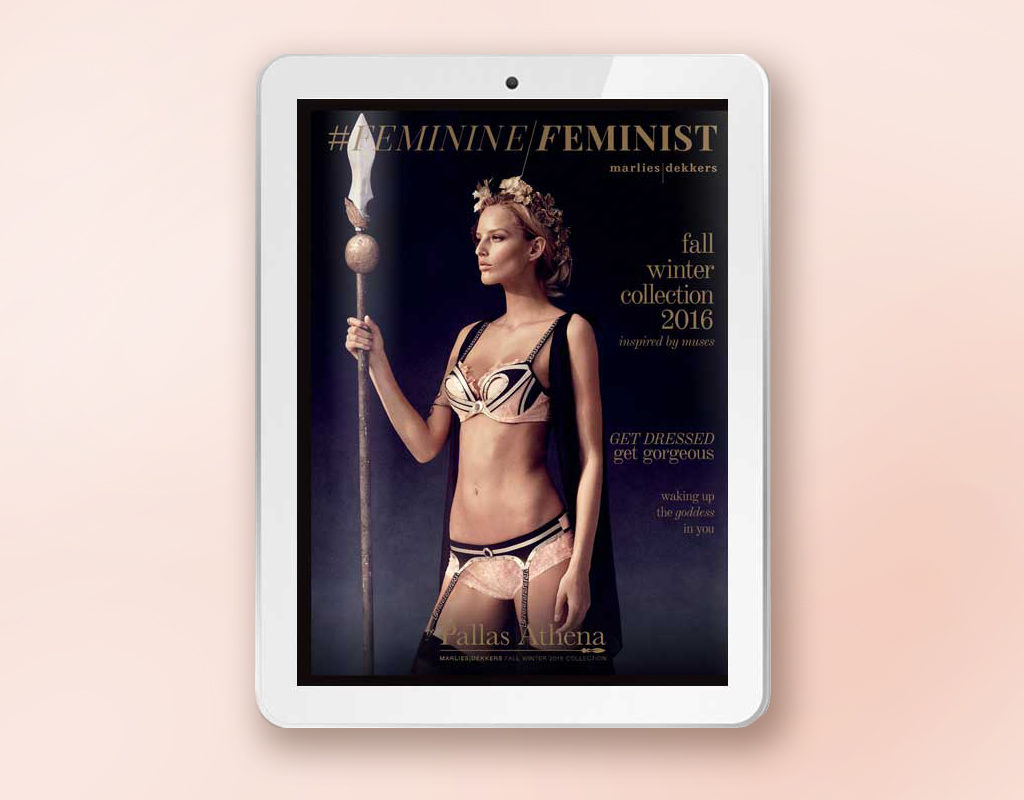
- Client: Marlies Dekkers
- Design
- Storytelling
- Site
In an age where storytelling on the web is becoming more and more important, creating online magazines is a growing industry. As a freelancer this is a very interesting challenge because every time you have to work with a different program and it’s pro’s and cons. In this case the client (Marlies Dekkers) used the program Issuu. I’ll explain the 3 most important things I keep in mind when designing online magazines.
Really tell a story
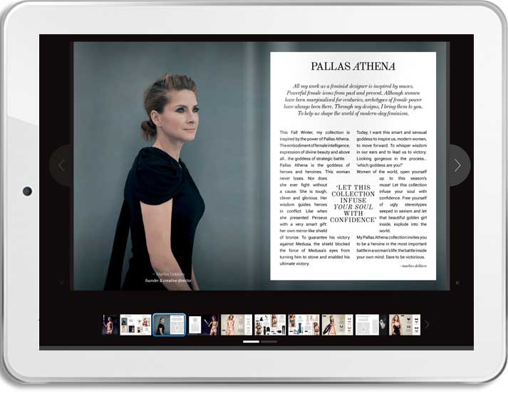
In this case the brand Marlies Dekkers knows what they are doing. Every bra has a story. These bra’s were inspired by goddesses. In the content and flow of the magazine we made sure the reader felt that throughout the whole magazine.
Although we often showed the product, the product was combined with a story. “Which goddess are you?”,”Get dressed”, explaining what’s so special about the bra et cetera. It’s important to think about the order of pages and if it stays logical to the reader.
Keeping the flow and making the magazine interesting to read is one of the most important things when you create an online magazine. Make it interesting with facts, movies, and make sure it doesn’t feel like a simple advertising brochure. Your goal is to increase brand engagement (research shows that when people are inspired they buy 17% more). If you just make a simple brochure with no story the magazine doesn’t add anything to your webshop. Because hardcore selling is what you already do on the rest of your site. People go to the magazine to get inspired so give them what they want.

Make the magazine responsive
The easiest way to make a responsive magazine is use a WordPress template and change to your needs and wishes. The magazine changes at every device. Movies, pictures et cetera can all adapt. And the content can will adapt to every device.
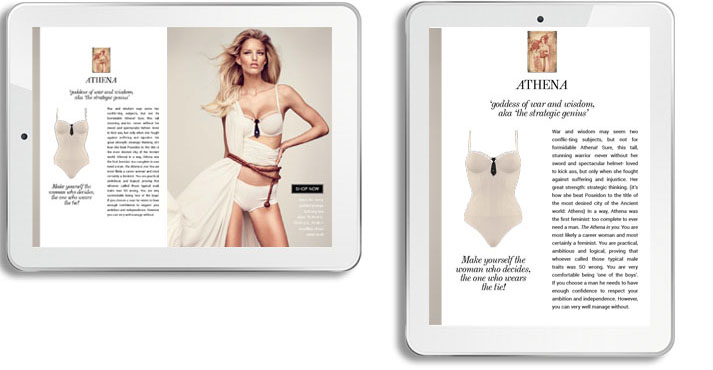
But what if the program doesn’t make that possible? Then you really have to make an effort as a designer. I always make sure that the headlines are even readable on a mobile phone. On a tablet the bodytext must have the right font size. In this case the pages are divided in the portrait mode. On a desktop the two portrait modes are combined. Naturally you test if the pages look good as a couple and on it’s own.

Make it easy to navigate
Everyone who makes online magazines knows that the first pages are always the ones people look at most. In this case we created an index in the beginning of the magazine. Now people can scroll through the magazine or go directly to the part they are interested in by clicking on it in the index. On desktops and bigger tablets a navigation menu is added to let the readers navigate to the pages they are interested in.
Keep buttons readable. In the ideal situation the buttons change on every device and are even readable on a mobile phone. If that is not possible, make the page clickable so the people can easily go to your landingpage. Where the buying begins. 🙂


